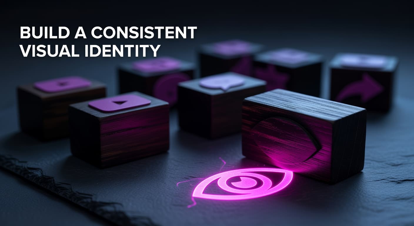
YouTube Thumbnail Visual Identity: Build a Consistent Style That Gets Clicked
Key Takeaways
- Established channels with consistent thumbnail styling see 15–20% higher CTRs from subscribers compared to channels with inconsistent visual identity.
- A thumbnail brand system built on 2–3 locked colors, one headline font, and 2–3 repeatable layouts gives you recognition without sacrificing per-video creativity.
- Series-specific visual cues — like a dedicated color band or icon — signal format familiarity to returning viewers before they even read your title, accelerating click decisions.
- Subscriber CTR and non-subscriber CTR measure brand recognition separately: strong subscriber CTR confirms your visual identity is working; strong non-subscriber CTR confirms broad appeal.
- Analyzing your top-performing thumbnails as a data set — not as individual designs — reveals the repeatable visual patterns worth locking into your brand system.
How a consistent channel thumbnail style builds recognition and steadily increases your click-through rate
The Thumbnail Viewers Click Before They Even Read the Title
A consistent YouTube thumbnail visual identity means your videos are recognizable at a glance — before a viewer reads the title, processes your topic, or consciously decides to click. It's the difference between a channel page that looks like a coherent brand and one that looks like a mood board of unrelated experiments. Most creators obsess over individual thumbnail performance in isolation. They swap an expression here, tweak a color there. But the creators gaining compounding CTR advantages aren't just designing individual thumbnails well — they're building visual systems. Those systems train your audience to recognize your content the moment it appears in Browse, Suggested, or Search feeds. This is the angle most thumbnail guides skip entirely. You'll find plenty of advice on color psychology, text placement, and facial expressions — and all of that matters. But none of it compounds the way a locked visual identity does. When a returning subscriber spots your thumbnail style from across a crowded feed and clicks without hesitation, that's brand recognition doing the heavy lifting. This spoke goes deep on exactly how to build that system, why it measurably improves CTR, and how to analyze your own existing thumbnails to extract the visual DNA that's already working for your channel.
How Does Thumbnail Consistency Actually Affect CTR?
The mechanism behind consistent thumbnail branding and higher CTR is rooted in cognitive fluency — the brain's preference for things it can process quickly and effortlessly. When a viewer has seen your thumbnails before, their brain recognizes the visual pattern faster than it can read your title. That speed reduces the friction of the click decision. Research cited across major YouTube creator education resources indicates that established channels with consistent thumbnail styling see 15–20% higher CTRs from subscribers compared to channels with inconsistent visual treatment. This gap isn't random — it reflects that returning viewers are clicking on channel recognition as much as on the individual video concept. But the CTR impact extends beyond your subscriber base. YouTube's Browse and Suggested feeds are algorithmic real estate, and the algorithm monitors CTR signals closely. According to YouTube's own data, CTR differences of even 0.5% can be statistically significant over time when measured across millions of impressions. A visual identity that trains both subscribers and new viewers to associate your thumbnail style with quality content creates a compounding signal advantage. Each video that performs slightly above average due to brand familiarity gives the algorithm more confidence to serve subsequent uploads more aggressively — a positive feedback loop that makes consistent branding one of the highest-leverage long-term investments a creator can make.
How subscriber CTR vs. non-subscriber CTR reveals the state of your thumbnail visual identity
| CTR Signal | What It Measures | What Low Numbers Indicate | What High Numbers Indicate |
|---|---|---|---|
| Subscriber CTR | How well returning viewers recognize and click your content | Weak visual identity — subscribers aren't spotting your videos on instinct | Strong brand recognition — subscribers click before reading the full title |
| Non-Subscriber CTR | How compelling your thumbnail is to cold audiences | Thumbnail concepts aren't immediately communicating value to new viewers | Broad appeal — your design language works beyond your existing audience |
| Overall CTR vs. Channel Average | Net thumbnail performance relative to your own baseline | Underperforming design: concept, execution, or both need attention | Above-average performance: study this thumbnail's elements for replication |
| CTR in Browse Features | Algorithm confidence in your thumbnail's broad click appeal | Thumbnail isn't competitive in head-to-head comparison with similar content | Strong signal for algorithmic amplification via Browse and Suggested feeds |
What Are the Core Elements of a Thumbnail Brand System?
YouTube Creator Academy emphasizes that consistent branding helps viewers instantly identify your content across mobile devices — critical when over 70% of YouTube watch time happens on mobile, where thumbnails render at sizes as small as 120 pixels wide. At that scale, complex design details vanish. What survives is your brand system: your colors, your font weight, and your dominant compositional pattern. A practical thumbnail brand system rests on three locked elements and two flexible ones. The locked elements are your color palette (2–3 primary colors, with defined HEX codes so you never eyeball it), your headline font (one bold, high-legibility typeface used at a consistent size hierarchy), and your logo or watermark placement (same corner, same opacity across every video). The flexible elements are your main image — which changes per video — and your layout variant, which you rotate between 2–3 pre-built templates rather than designing from scratch each time. This structure is what channels like WIRED execute masterfully: their Autocomplete Interview series uses a distinct solid green background, while Tech Support uses blue — each series has its own visual cue, but both belong unmistakably to WIRED's wider design language. For creators building a personal brand, this same approach applies at the channel level: your colors and font become the fixed anchor, while your pose, expression, and background vary enough to feel fresh per video without ever feeling unfamiliar.
Step-by-step process to build your YouTube thumbnail brand system from existing content
- Audit your top 10 performing thumbnails: Pull your highest-CTR videos from YouTube Studio and lay all thumbnails side-by-side. Look for unintentional patterns — colors that recur, layouts that repeat, text placements that appear more than once. These are clues to what's already resonating visually with your audience.
- Extract your accidental visual DNA: Note the 2–3 colors that appear most frequently, the font weights that dominate, and whether your focal point (face, product, graphic) tends to sit left, right, or center. This existing pattern is your starting point — you're systematizing what's already working, not starting from scratch.
- Define your brand toolkit (not a rigid template): Lock in 2–3 HEX color codes, one primary headline font with a defined size range, one logo placement position, and 2–3 layout templates. Write these down as a one-page style guide. This becomes your production reference for every future thumbnail.
- Apply series-specific visual cues for recurring content formats: If you produce multiple content types (tutorials, reviews, commentary), assign a secondary accent color or border treatment to each series. Viewers who binge your tutorials will recognize the next one instantly, driving sequential clicks and watch time.
- Monitor subscriber CTR vs. non-subscriber CTR monthly: In YouTube Studio Analytics, track these two CTR metrics separately. Rising subscriber CTR over 60–90 days following brand system implementation is direct evidence that your visual identity is compounding. Flat or declining non-subscriber CTR signals your design language may need broader appeal testing.
Evolving Your Thumbnail Style Without Losing Recognition
The most common fear creators have about committing to a visual identity is creative stagnation. That fear is understandable but misplaced. Consistency and creativity aren't opposites — they operate on different layers of your design. Your brand elements (colors, font, logo placement) are the fixed layer. Your visual concept (the scene, the expression, the metaphor, the energy) is the creative layer, and it should change with every video. The right frame is this: think of your thumbnail system as a toolkit, not a template. A toolkit gives you brand-locked building blocks to work with. A template locks every decision and eventually produces thumbnails that feel identical — which is where 'consistency builds recognition; monotony kills performance' as a design principle kicks in. Refreshing your brand system entirely every 12–18 months is healthy, but it should be done surgically: test one brand element at a time using YouTube Studio's Test and Compare feature rather than overhauling your visual identity overnight. An abrupt rebrand can temporarily suppress CTR from subscribers who've been trained on your previous visual language, so gradual, data-informed evolution protects the recognition equity you've built.
Your Thumbnail Brand System Is a Long-Term CTR Asset
Individual thumbnail wins are great. A locked visual identity that compounds across hundreds of videos is the real game. The creators building durable YouTube channels aren't redesigning from scratch with every upload — they're executing a defined brand system that makes their content instantly recognizable in any feed placement. Start with your existing top performers. The visual DNA is already there. Your job is to extract it, document it, and apply it forward with intention. For a deeper foundation on the design principles that make individual thumbnails click-worthy in the first place, explore our full guide to YouTube Thumbnail Design for Higher CTR — and then layer your brand system on top of those fundamentals.