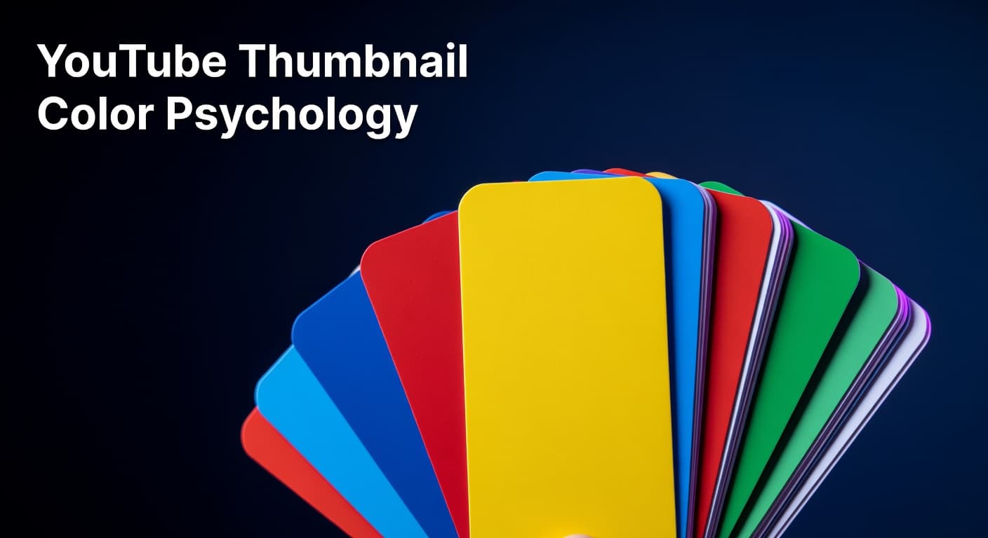
YouTube Thumbnail Color Psychology for Higher CTR
How strategic color choices in your thumbnails drive more clicks and more views
The Color Choice Your CTR Depends On
Most creators spend hours scripting, filming, and editing their videos — then spend about three minutes choosing thumbnail colors based on personal taste. That's a costly mistake. Color is the first visual signal a viewer processes when scrolling through YouTube's feed, and it fires off a subconscious judgment about whether to click long before the title is read or the subject is recognized. Research consistently shows that high-contrast thumbnails using bold, saturated colors can increase CTR by 20–30% compared to muted or monochromatic designs. The difference between a thumbnail that gets scrolled past and one that stops a viewer cold often comes down to one decision: color. YouTube's interface is dominated by white and dark gray. That's not a detail — it's an opportunity. Thumbnails built around bright yellows, electric blues, intense reds, and vibrant greens naturally cut through that neutral backdrop and pull the eye in ways that softer palettes simply cannot. Understanding the psychology behind these color responses, and learning to apply it to your own channel's visual identity, is one of the highest-leverage design skills you can build. This post breaks down the color science behind top-performing thumbnails, gives you a niche-specific color framework, and shows you how to test and lock in the palette that drives consistent results for your channel. It's a targeted deep dive that extends the broader principles covered in our guide on YouTube thumbnail design for higher CTR.
Why Thumbnail Color Contrast Drives Clicks
Color contrast is not simply about making things look vibrant or eye-catching. At a neurological level, the human brain is wired to detect contrast as a survival signal — it's how we distinguish objects from their environment. On YouTube, that same mechanism becomes a click trigger. When your thumbnail uses colors that create strong differentiation between foreground and background elements, the brain registers it instantly, even during a fast scroll. The most effective thumbnails use complementary colors — hues that sit opposite each other on the color wheel. Blue and orange, red and green, yellow and purple. These pairings create visual tension that demands attention. Pairing yellow text on a dark background, or placing a brightly colored subject against a deep, saturated backdrop, forces the eye to focus without any conscious effort from the viewer. The platform environment matters too. Because YouTube's interface sits on white or dark gray, thumbnails that mirror those neutral tones disappear into the feed. A thumbnail that's predominantly white or gray blends directly into the YouTube UI, essentially becoming invisible. Bright, saturated hues with high contrast don't just stand out from competing thumbnails — they stand out from the interface itself. That distinction is the foundation of a color strategy that reliably improves CTR over time.
Thumbnail Color Psychology: Emotional Signals by Hue and Best Niche Applications
| Color | Emotional Signal | CTR Lift vs. Neutral | Best-Fit Niches |
|---|---|---|---|
| Red / Orange | Urgency, excitement, energy | Up to +23% | News, finance, gaming, challenges |
| Yellow | Optimism, clarity, attention | Up to +19% | Education, personal development, vlogs |
| Blue | Trust, authority, calm | Up to +17% | Tech, business, tutorials, health |
| Green | Growth, freshness, safety | Up to +14% | Fitness, sustainability, money, food |
| Purple | Mystery, creativity, premium | Up to +12% | Beauty, spirituality, entertainment |
| Black (contrast) | Boldness, drama, luxury | High contrast boost | True crime, cinematic, finance, tech |
Building a Color Strategy by Niche
One of the most actionable shifts you can make is moving away from choosing thumbnail colors based on what you personally like, and toward choosing colors based on what your specific audience responds to. Color psychology is not universal — what performs in a finance channel's thumbnail palette will actively underperform on a lifestyle or food channel. For tutorial and educational content, blue and green hues project trust and clarity — exactly the emotional tone a viewer wants before committing time to learn something. For entertainment, challenge, and gaming content, red and yellow combinations deliver the urgency and excitement that match viewer expectations. Finance and business channels often benefit from high-contrast dark backgrounds paired with bold white or gold text, which signals authority and premium value. A practical starting point is to study the thumbnail palettes of the top five channels in your niche. Look at what colors dominate their highest-performing videos. Then — and this is the counterintuitive move — consider introducing a color that creates contrast against that established niche palette, not just against YouTube's interface. If every tech channel in your space uses deep blues, a bold orange or electric green thumbnail will pop not just off the feed, but off your competitors as well. Consistency matters just as much as the initial choice. Data shows that channels with a consistent thumbnail color scheme see 15–20% higher CTR from subscribers compared to channels with inconsistent visual approaches. Returning viewers develop a pattern recognition response — they spot your color palette before they read your title. That recognition is a loyalty signal that translates directly to clicks. A workable system is to select two to three primary colors, build three to five thumbnail templates around those colors, and use that palette across at least 80% of your uploads.
6-Step Color Strategy Framework for Higher Thumbnail CTR
- Audit your niche palette: Screenshot the thumbnails of your top 10 competitors and identify the dominant colors. Note where the visual crowding is — that's where contrast opportunity lives.
- Choose your anchor color: Pick one primary, high-saturation color as your brand anchor based on the emotional signal your content needs to send (energy, trust, excitement, authority).
- Select a complementary contrast color: Use a color wheel to identify your anchor's complement. This becomes your text or accent color, creating the visual tension that stops scrolling.
- Test in grayscale: Before finalizing any thumbnail, convert it to grayscale. If foreground elements disappear or become indistinguishable from the background, your contrast is too low and CTR will suffer.
- Build 3 repeatable templates: Lock your color decisions into a small number of reusable thumbnail layouts. Consistency accelerates subscriber recognition and reduces your design time per video.
- Isolate color in A/B tests: When testing thumbnail variations, change only the color scheme while keeping face placement, text, and composition identical. This isolates color's actual impact on your CTR data.
Testing Thumbnail Colors with Real CTR Data
Knowing which colors work in theory is useful. Knowing which colors work for your specific audience is decisive. The only way to get that answer is through systematic testing using real YouTube performance data. YouTube Studio's built-in thumbnail testing feature allows creators to compare up to three thumbnail variations simultaneously on the same video. This is the most direct tool available for measuring how color changes actually move your CTR needle. The key discipline is changing only one variable at a time — if you swap the color scheme, keep the face position, text size, and composition consistent. Isolating the variable is what turns a test into usable data rather than noise. Beyond formal A/B tests, your Impressions Click-Through Rate metric in YouTube Studio tells a clear story over time. Establish a baseline CTR for your current thumbnail style, then track how new color approaches perform against that benchmark across five to ten videos. Patterns emerge quickly. If your orange-on-black palette consistently outperforms your blue-on-white variant by even a few percentage points, that difference compounds dramatically across thousands of impressions. For evergreen content that continues to accumulate impressions, refreshing the thumbnail with a stronger color approach is worth revisiting every three to six months. A low-performing video with strong watch time can often be revived simply by updating to a bolder, higher-contrast color palette without changing anything else about the video. The content quality was never the problem — the visual signal wasn't pulling viewers in.
Color Is a Conversion Decision, Not a Design Preference
Thumbnail color psychology is not about making your videos look good — it's about engineering the visual trigger that converts an impression into a click. Every color choice either works with or against the psychological signals your audience is already responding to, often without knowing it. Start by auditing your niche, anchor your palette around the emotional tone your content needs to project, build in complementary contrast, and test your decisions against real CTR data from YouTube Studio. Consistency over time transforms your color palette from a design element into a brand recognition signal that your subscribers click instinctively. For a complete framework covering every element of thumbnail design — from composition and typography to psychological triggers beyond color — explore our full guide on YouTube thumbnail design for higher CTR.