
How to Make YouTube Thumbnails That Stop the Scroll in Any Feed
Jun 1, 2026
TubeAI - Yo...
Your thumbnail never appears in isolation — it competes against dozens of others on every YouTube surface. Learn the pattern interrupt techniques and ...
Data-backed visual strategies that turn passive scrollers into active viewers and accelerate channel growth
Data-backed visual strategies that turn passive scrollers into active viewers and accelerate channel growth
Every video you upload lives or dies in under a second. That is not an exaggeration. When a viewer encounters your content anywhere on YouTube — the home feed, search results, suggested video panels — their brain processes your thumbnail before their eyes even reach your title. One second. Maybe less. That snap judgment determines whether your video earns a click or gets scrolled past forever. Here is the uncomfortable truth most creators overlook: you can produce the most insightful, well-researched, impeccably edited video of your career, and it will go completely unnoticed if your thumbnail fails to earn that click. Content quality matters enormously once viewers are inside your video. But the thumbnail is the bouncer at the door. And right now, with over 500 hours of content uploaded to YouTube every single minute, the competition for viewer attention has never been more intense. The data makes the case clearly. According to YouTube's own research, 90% of top-performing videos on the platform use custom thumbnails. Studies analyzing thousands of high-performing videos show that well-optimized thumbnails can increase click-through rates by 30 to 40%, directly compounding every other growth metric on your channel. Meanwhile, YouTube-wide CTR typically ranges between 2% and 10%, meaning most creators have significant room to improve — and those improvements have an outsized ripple effect on views, watch time, and algorithmic distribution. So what separates a thumbnail that converts at 8% from one that converts at 2%? It is not luck. It is not having a massive budget. It is not even natural design talent. It is a systematic understanding of visual psychology, platform mechanics, and iterative testing. This guide breaks down that entire system — from the foundational principles that govern viewer behavior, to the specific design decisions that move the CTR needle, to the testing frameworks that separate guessing from knowing.
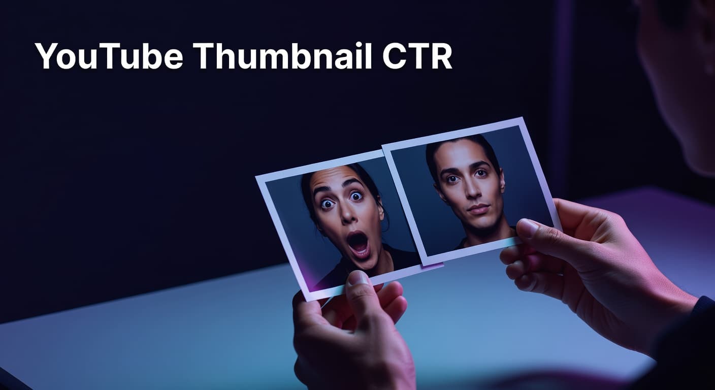
Understanding why viewers click is more valuable than any list of design tips. Thumbnails are not evaluated consciously. Viewers do not deliberate — they react. Which means thumbnail design is fundamentally an exercise in applied psychology, not aesthetics. The most well-documented driver of thumbnail performance is human faces displaying strong emotion. Research consistently shows that expressive faces — genuine surprise, excitement, curiosity, even concern — can increase CTR by 20 to 30% compared to thumbnails without faces or with neutral expressions. The mechanism is rooted in how humans process social information: we are wired to read faces before anything else in our visual field. A thumbnail featuring a face with a strong expression essentially hijacks that instinct and pulls the viewer's attention to your content before they have consciously decided to engage. Color contrast is the second major lever. High-contrast thumbnails — where the foreground subject, text overlay, and background are visually distinct from one another — stop the scroll in ways that harmonious, low-contrast designs cannot. Bold, warm colors like yellows and oranges consistently outperform cooler, muted palettes in many niches, particularly when they appear against dark or deeply contrasting backgrounds. The principle is simple: contrast is communication, and on a platform where your thumbnail competes with hundreds of others in a single feed view, communication speed is everything. Simplicity is the third pillar, and it is where many creators go wrong. Thumbnails crammed with multiple focal points, excessive text, and cluttered backgrounds might look detailed at full resolution on a desktop monitor. But more than 70% of YouTube views happen on mobile devices, where your thumbnail renders at a fraction of that size. On a phone screen, visual complexity collapses into noise. The rule practiced by top creators is one focal point per thumbnail — one dominant subject, one core message, maximum three to five words of text. That constraint is not a creative limitation. It is what makes thumbnails perform. Finally, there is the concept of the curiosity gap — the perceived distance between what the thumbnail reveals and what the video promises to explain. Thumbnails that show something intriguing but incomplete, that pose a visual question without answering it, tend to generate stronger click compulsion than thumbnails that give the full picture away upfront. The brain wants resolution. A well-engineered thumbnail withholds just enough to make clicking feel necessary.
YouTube CTR Performance Benchmarks by Range — What Your Numbers Actually Mean
| CTR Range | Performance Classification | What It Signals & What To Do |
|---|---|---|
| Below 2% | Needs Immediate Attention | Thumbnail or title (or both) are failing to connect. Redesign thumbnail with stronger contrast and clearer focal point. Test new title angle immediately. |
| 2% – 4% | Average / Below Par | You are in the middle of the pack. Small design improvements to contrast, emotion, or text clarity can move you into the strong-performing range. |
| 4% – 6% | Solid Performance | Your thumbnail and title combination is working. Focus on maintaining consistency and start systematic A/B testing to find your ceiling. |
| 6% – 8% | Strong Performer | You are outpacing most creators in your niche. Analyze what is driving this and replicate the winning formula across your content library. |
| 8% – 10%+ | Exceptional / Top Creator Level | Top creators achieve this through systematic testing, strong visual branding, and deep audience understanding. Use these videos as your design benchmark. |
Knowing the psychology is one thing. Translating it into consistent design decisions is where most creators stall. So let us get specific about what actually moves the needle on thumbnail CTR when applied systematically across a channel. Start with technical specifications, because none of the creative work matters if your thumbnail renders poorly. The standard dimensions are 1280 by 720 pixels at a 16:9 aspect ratio, with a maximum file size of 2MB. Design at full resolution, then always preview your thumbnail at roughly 10% scale — approximately 128 by 72 pixels — which simulates how it appears in a crowded mobile feed. If the core message is not instantly readable at that size, the design needs simplification before it goes live. Text overlays deserve their own strategic attention. The data points clearly toward restraint: thumbnails with fewer than 12 characters of text significantly outperform text-heavy designs. This is not about avoiding text entirely — it is about making every word earn its space. Three to five words maximum, set in a large, bold, high-contrast typeface that remains legible at small sizes. Text should support and amplify the visual message, not replace it. Branding consistency is a growth multiplier that compounds over time. Research shows that established channels with consistent thumbnail styling — recurring color palettes, predictable layout structures, recognizable visual signatures — achieve 15 to 20% higher CTRs from subscribers compared to channels with inconsistent approaches. When viewers recognize your thumbnail style in their feed, the cognitive load of the click decision drops dramatically. They already know they like your content. The thumbnail just needs to remind them it is you. Critically important is the alignment between your thumbnail and your actual video content. This is where the short-term temptation of clickbait collides with long-term channel health. YouTube's algorithm does not just reward high CTR — it rewards the combination of CTR and sustained watch time. A misleading thumbnail that drives clicks but causes immediate viewer drop-off sends a damaging signal to the algorithm, one that can suppress your video's distribution and erode your channel's overall recommendation standing. The thumbnail is a promise. Your content is the delivery. Both must align for the system to work in your favor.
Proven Thumbnail Design Elements That Consistently Drive Higher CTR
Here is a question worth sitting with: if two creators publish videos on identical topics with equivalent content quality, what separates the one that generates 8% CTR from the one stuck at 3%? More often than not, it is not the first thumbnail they published. It is the fifth. It is the result of a systematic testing discipline that most creators skip entirely. YouTube's native Test and Compare feature — accessible directly within YouTube Studio — allows creators to upload up to three thumbnail variations for a single video and run concurrent tests with real audience impressions. YouTube distributes impressions across the variations and surfaces the version driving the highest watch-time share, which is a stronger signal than raw CTR alone. This tool has fundamentally changed what is possible for creators who use it intentionally. Rather than committing to a single design and hoping, you can run controlled experiments on specific variables: face versus no face, text overlay versus clean image, warm color scheme versus cool palette. The testing discipline that separates top performers from the rest is isolation — changing one variable at a time, running tests for a minimum of 72 hours to accumulate meaningful data, and documenting outcomes in a running log that becomes your channel's proprietary visual intelligence over time. Channels that treat thumbnail design as an iterative, data-driven process rather than a creative one-shot exercise have reported CTR improvements of 150 to 200% across multiple testing cycles. Looking at the broader trajectory of YouTube thumbnail strategy in 2026 and beyond, several platform and audience shifts are worth tracking. Mobile-first optimization has moved from best practice to non-negotiable, with over 70% of YouTube viewing occurring on smartphones. The trend toward bolder, higher-contrast visual palettes — including neon color combinations that register vividly on OLED screens — is accelerating, particularly in gaming, entertainment, and commentary niches. Meanwhile, the rise of data-driven thumbnail generation using agentic design tools is enabling creators to produce multiple tested variations far more efficiently than manual design workflows allowed in previous years. Channels that build a systematic thumbnail review cadence — auditing underperforming videos every three to six months and refreshing thumbnails using current performance data — consistently outperform channels that treat thumbnails as upload-and-forget assets. A low-performing evergreen video updated with a stronger thumbnail can re-enter YouTube's recommendation loop and generate a fresh wave of views with zero additional content production.
Most creators think of thumbnail design as a creative task. The ones growing fastest treat it as a performance discipline. There is a meaningful difference between those two orientations, and it shows up directly in CTR data. The principles covered here — emotional psychology, contrast-driven design, text restraint, consistent visual branding, and systematic A/B testing — are not theoretical. They are extracted from the actual behavior of millions of YouTube viewers and validated across channels at every size and in every niche. They are also cumulative. Each incremental CTR improvement compounds over the lifetime of your channel, because every video that earns more clicks earns more impressions from the algorithm, which earns more clicks, which earns even more impressions. The creators who understand this do not leave thumbnail performance to intuition. They analyze what is working across their niche using real data, generate design concepts grounded in proven visual patterns, and test variations systematically rather than committing blindly to a single design. That is the system. And for creators who want to build it efficiently — from analyzing competitor thumbnail patterns to generating and testing multiple design concepts — having the right data-driven tools in your workflow is what separates the channels that grow from the ones that stall. Your next click is waiting. Make your thumbnail worth it.
Your thumbnail never appears in isolation — it competes against dozens of others on every YouTube surface. Learn the pattern interrupt techniques and ...

Your YouTube analytics contain precise signals about why your thumbnails succeed or fail. Learn how to read CTR data by traffic source, diagnose real ...

Your back catalog is a goldmine hiding behind outdated thumbnails. Learn the data-backed framework for auditing, refreshing, and retesting thumbnails ...
Your YouTube thumbnail and title should never say the same thing. Learn how to pair them as a unified packaging unit that creates irresistible curiosi...
Thumbnail storytelling is one of the highest-leverage CTR techniques available to YouTube creators. By engineering a deliberate curiosity gap — showin...
Most creators lose clicks not because their videos are bad — but because their thumbnails make invisible, fixable mistakes. This guide breaks down the...
Making a YouTube thumbnail that actually earns clicks isn't about being a designer — it's about understanding a repeatable system. This guide breaks d...
The background of your YouTube thumbnail does far more than fill empty space — it either amplifies your subject or drowns it out. This guide breaks do...

A thumbnail that works brilliantly in the gaming niche can quietly kill CTR on a finance channel. Understanding how thumbnail design conventions diffe...
Most thumbnail mistakes aren't discovered in Photoshop — they're discovered when your carefully crafted design shrinks to a postage stamp on someone's...
A consistent YouTube thumbnail visual identity turns casual viewers into instant recognizers — and recognizers into clicks. Discover how building a co...

Human faces and emotional expressions are among the most powerful — and most misunderstood — levers in YouTube thumbnail design. This guide breaks dow...
Most creators pick one thumbnail and hope for the best — but top-performing channels treat thumbnail selection as a data decision. This guide breaks d...
Thumbnail composition is the invisible architecture behind every high-CTR YouTube video — the arrangement of subject, text, and background that tells ...
The words you put on your thumbnail — and how you display them — can be the single variable that separates a 2% CTR from a 7% one. This guide breaks d...
Color is the first thing a viewer notices in your thumbnail — before your face, your title, or anything else. Understanding thumbnail color psychology...

Most creators obsess over view counts, but CTR is the metric that actually controls how many views YouTube gives your videos in the first place. This ...