YouTube Thumbnail Composition and Visual Hierarchy for Maximum CTR
Key Takeaways
- Effective thumbnail composition uses a clear focal point — one dominant visual element — to guide a viewer's eye within 300 milliseconds of seeing your thumbnail.
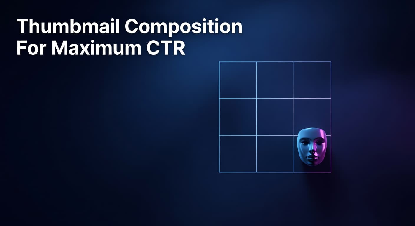
- Applying the rule of thirds by placing your subject at a grid intersection rather than dead center creates natural visual tension that makes thumbnails more compelling to click.
- Simplifying your layout to a single subject against a contrasting background can more than double your CTR, as demonstrated by real creator case studies showing jumps from 1.8% to 4.2%.
- Visual hierarchy layers (foreground subject, mid-ground text, background field) work together so that viewers instantly understand your video's value proposition without reading a single word.
- Consistent composition patterns across your channel build visual recognition that produces 15–20% higher CTR from returning subscribers compared to channels with inconsistent thumbnail layouts.
How visual hierarchy and layout structure determine whether viewers stop scrolling or keep moving
Why Composition Decides Clicks Before Color or Text Ever Do
YouTube thumbnail composition is the spatial arrangement of every visual element — subject, text, background, and negative space — in a way that controls where a viewer's eye travels and what emotion they feel in the fraction of a second before they decide to click. The layout of your thumbnail communicates your video's value faster than any word or color can, because the human brain processes visual structure in roughly 300 milliseconds — before conscious reading begins. Most creators spend hours obsessing over color palettes and font choices while treating composition as an afterthought. That's a costly mistake. Even the most vibrant colors and boldest text will fail to convert if the underlying layout creates visual clutter, hides your focal point, or forces the viewer's eye to wander without a destination. This spoke post zooms in on the compositional mechanics behind high-CTR thumbnails — the foundational pillar of effective YouTube thumbnail design. You'll learn how to structure your thumbnail's three visual zones, apply the rule of thirds to create natural visual tension, use negative space strategically, and build a layout system that scales across your entire channel. These are the principles that separate thumbnails that look professional from thumbnails that actually perform.
How Does Visual Hierarchy Affect Thumbnail Click-Through Rate?
Visual hierarchy is the principle that not all elements in a design carry equal visual weight — and that guiding your viewer's eye in a deliberate sequence is what separates a thumbnail that communicates instantly from one that just looks busy. In thumbnail terms, hierarchy means your viewer's gaze should hit your focal point first, absorb your supporting element second, and register your background context third — all within roughly half a second. The data backs this up decisively. A real-world case study documented a creator who simplified a gaming thumbnail from four characters to a single face with a shocked expression. CTR jumped from 1.8% to 4.2% over seven days — a 133% improvement driven entirely by removing compositional clutter and establishing a clear focal point. Research examining 740 of YouTube's top-performing videos confirmed that successful thumbnails consistently prioritize a single dominant visual element rather than competing for attention across multiple subjects. The three-zone layout framework is the most practical application of visual hierarchy for YouTube creators: place your primary subject in the foreground at roughly 40–50% of the canvas, position concise text or a supporting graphic in the mid-ground, and keep your background field clean enough to provide contrast without competing. When each zone serves a distinct role, viewers process your thumbnail's message in the correct order — and that efficient visual communication is what triggers the click impulse.
Three-Zone Thumbnail Composition Framework: Role, Placement, and CTR Impact of Each Visual Layer
| Visual Zone | Element Type | Recommended Placement | Primary CTR Function |
|---|---|---|---|
| Foreground (Zone 1) | Primary subject — face, product, or graphic | Center-left or rule-of-thirds intersection; fills 35–50% of canvas | Creates immediate focal point; stops the scroll within 300ms |
| Mid-ground (Zone 2) | Text overlay or supporting graphic | Lower third or opposite side from subject; 3–5 words maximum | Delivers the content promise; reinforces the click reason |
| Background (Zone 3) | Contrasting color field, blurred scene, or gradient | Full canvas behind zones 1 and 2; high contrast against subject | Separates subject from feed clutter; reinforces brand color identity |
| Negative Space | Empty or low-detail area intentionally left open | Adjacent to subject; creates breathing room around focal point | Amplifies subject prominence; prevents visual overload on mobile |
What Is the Rule of Thirds and Why Does It Work for Thumbnails?
The rule of thirds is a compositional principle borrowed from photography and film: divide your canvas into a 3×3 grid of equal sections, then place your primary subject at or near one of the four intersection points rather than directly in the center. This off-center placement creates natural visual tension — a slight imbalance that the human brain finds more engaging than perfect symmetry. For YouTube thumbnails, this translates directly into higher click-through rates because thumbnails that use rule-of-thirds placement look inherently more dynamic and intentional than centered compositions. According to YouTube Creator Academy guidance on visual content, thumbnails that clearly guide viewer attention to a single compelling element consistently outperform visually cluttered or overly symmetrical designs. Placing your face or primary subject at a left or right intersection also creates open space on the opposite side — which is exactly where supporting text or a secondary graphic element should live, creating a natural left-to-right reading flow that mirrors how most viewers scan content. Practically, this means that when you position yourself or your main visual at the left-center intersection of the grid, your eye-catching text naturally occupies the right portion of the frame without covering your face. Top creators use this layout consistently because it solves one of thumbnail design's most common failures: text that obscures the subject and forces the viewer to choose which element to focus on. Thumbnails using directional composition — where one element points toward or leads the eye to another — can increase CTR by up to 25% by concentrating viewer focus on a single visual target. That's a compounding advantage that grows with every impression your video earns.
6-Step Composition Checklist Before Publishing Any YouTube Thumbnail
- Define your single focal point first — decide whether your subject is a face, a product, or a graphic, then ensure no other element matches its visual weight or size on the canvas.
- Apply the rule of thirds grid — position your primary subject at a grid intersection rather than dead center, and verify that supporting text occupies the opposite open zone.
- Check your three zones — confirm your foreground subject, mid-ground text, and background field each occupy distinct visual layers with clear contrast between them.
- Run the mobile shrink test — resize your thumbnail to approximately 168×94 pixels and verify that your focal point is still immediately recognizable and your text (if any) remains legible.
- Audit for visual clutter — remove any element that doesn't serve zone 1, 2, or 3 directly; if an element doesn't earn its space by guiding the eye or communicating the content promise, delete it.
- Verify subject-to-background contrast — ensure your primary subject is at least 30% brighter or darker than the background field so it separates cleanly from competing thumbnails in the YouTube feed.
Building a Scalable Composition System for Your Channel
The most durable competitive advantage in thumbnail design isn't a single great composition — it's a repeatable layout system that makes every thumbnail instantly recognizable as yours while still feeling fresh for each individual video. Research consistently shows that established channels with consistent thumbnail composition patterns achieve 15–20% higher CTR from returning subscribers compared to channels with inconsistent layouts, because visual familiarity reduces the cognitive friction of deciding to click. Building your composition system means defining a small set of layout templates — typically two or three — that lock your brand elements (subject positioning zone, text placement zone, and background treatment) while allowing the specific visual content to change per video. Define your brand colors, one or two typefaces, and your preferred rule-of-thirds orientation, then vary only the subject matter and supporting graphic within that framework. This is the difference between a fixed template (which breeds monotony) and a compositional toolkit (which breeds recognition). As you publish more videos, use your channel's analytics to identify which layout variant drives the highest CTR in each content series. Channels that systematically test and refine their composition templates — iterating on subject placement, background contrast, and negative space distribution — compound their improvements over time, turning thumbnail design from a per-video guessing game into a data-driven growth engine. Platforms that surface niche-level composition benchmarks make this iteration dramatically faster by showing which layout patterns drive outlier performance across similar channels.
Composition Is the Foundation — Everything Else Builds on It
Every other element of your thumbnail — color, text, facial expression, contrast — can only do its job if the underlying composition gives it the right platform to perform. A great color scheme placed in a cluttered layout still loses to a simpler, well-structured competitor in the feed. The creators who grow fastest aren't just the ones with the boldest colors or the catchiest text; they're the ones who've built a clear visual hierarchy that guides the viewer's eye to one compelling reason to click, every single time. Start with your focal point, apply the rule of thirds, respect your three visual zones, and then test your layout at mobile scale before publishing. For a deeper look at the full spectrum of thumbnail design decisions — including color psychology and text strategy — explore the complete YouTube thumbnail design guide this post is part of. Composition is where CTR improvement begins.