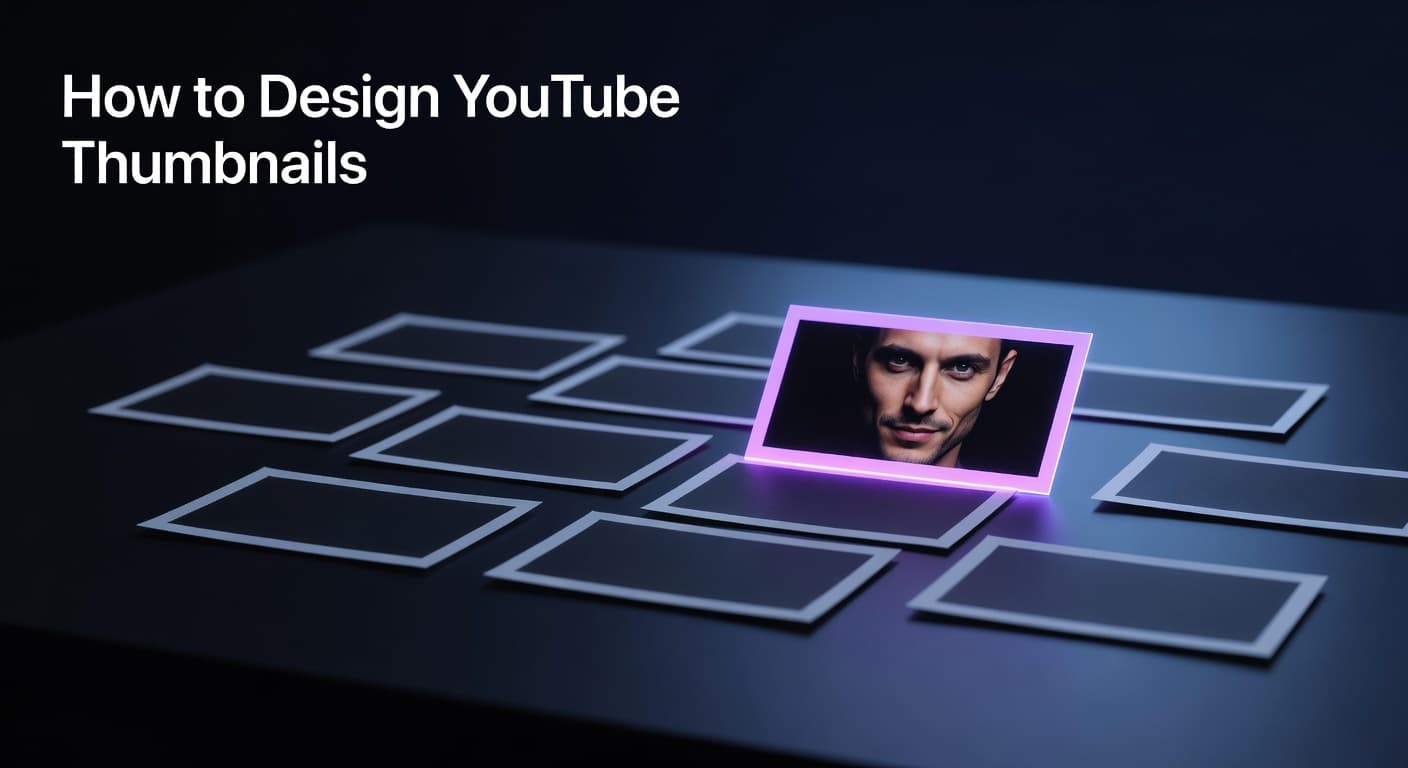
How to Design YouTube Thumbnails Without Graphic Design Skills
Key Takeaways
- According to YouTube Creator Academy, 90% of best-performing YouTube videos use custom thumbnails — making thumbnail creation a non-negotiable growth lever, not an optional extra.
- Thumbnails with expressive faces can increase CTR by 20–30%, but the visual principles behind that lift (emotion, contrast, clarity) apply equally to faceless channel designs.
- A good thumbnail CTR starts at 4% or above — and closing the gap between your current rate and that benchmark is one of the highest-leverage optimizations available to any creator.
- Agentic thumbnail workflows analyze your channel's existing visual identity and replicate it automatically, eliminating style inconsistency without requiring manual design knowledge.
- Designing for mobile first — where over 70% of YouTube traffic originates — is the single biggest structural shift that separates effective thumbnails from ones that get scrolled past.
How data-backed principles and agentic tools replace years of design training for new creators
The Thumbnail Is the First Algorithm Your Video Has to Beat
You can produce professional YouTube videos without editing skills, but the thumbnail is the one element that determines whether anyone watches them in the first place. A thumbnail is your video's click-through gate — it sits between your content and the viewer, and no amount of production quality overcomes a thumbnail that fails to earn that initial click. For creators who don't have a background in graphic design, this has historically meant one of three options: spend weeks learning Photoshop, pay a freelance designer $50–$200 per thumbnail, or settle for generic auto-generated frames that YouTube selects for you. None of those options scales. But the landscape has fundamentally changed. Data-driven thumbnail strategy replaces design intuition with repeatable principles anyone can apply. Understanding why certain thumbnails generate clicks — contrast, focal clarity, emotional signaling, mobile legibility — removes the guesswork that makes design feel intimidating. Paired with agentic tools that analyze your channel's visual identity and generate on-brand concepts from your script or video URL, the skill barrier that once separated beginner creators from polished channels has effectively disappeared. This guide covers everything from the foundational CTR principles that govern what gets clicked, to the practical workflow for creating thumbnails that look like a professional made them — without requiring you to become one.
Why Does Your Thumbnail Control Your Channel's Growth Rate?
The thumbnail is the primary signal viewers use to decide whether your video is worth their time, and it operates on a compressed timeline. Research indicates that 68% of mobile viewers decide to click within one second of encountering a thumbnail — a decision window so narrow that design complexity actively works against you. The YouTube algorithm reflects this: it doesn't evaluate your thumbnail visually, but it reacts to CTR and watch-time share, the downstream effects of whether your thumbnail earns clicks and delivers on its visual promise. According to YouTube Creator Academy, 90% of the best-performing videos on the platform use custom thumbnails. That single statistic frames the entire conversation — auto-generated frames leave you competing against yourself. Studies referenced across multiple industry analyses, including data cited by Backlinko, show that videos with custom thumbnails see 60–70% higher click-through rates on average compared to those relying on auto-selected frames. Interestingly, the CTR impact isn't uniform across the platform. YouTube's own benchmarks place a normal CTR range between 2% and 10% for half of all channels and videos, with 4%+ representing a meaningful performance threshold. Gaming content achieves the highest median organic CTR at around 8.5%, while educational content clusters near 4.5% — meaning niche context matters enormously when evaluating whether your thumbnail is actually performing or just matching a lower baseline. Understanding your niche's typical CTR range is the starting point for any thumbnail optimization strategy that's grounded in evidence rather than assumption.
YouTube Organic CTR Benchmarks by Content Niche (2025–2026 Data)
| Content Niche | Median Organic CTR | Key Thumbnail Driver |
|---|---|---|
| Gaming | 8.5% | High energy composition, character faces, bold text |
| Entertainment & Lifestyle | 6–8% | Expressive host faces, vibrant color contrast, curiosity gap |
| How-To & Tutorial | 5–6% | Clear outcome preview, before/after visual, minimal text |
| Business & Finance | 5–6% | Authority signals, data callouts, clean professional layout |
| Educational | 4.5% | Concept illustration, clean backgrounds, strong text hierarchy |
| Faceless / Stock-Based | 4–6% | High contrast imagery, bold title text, strong focal subject |
What Makes a Thumbnail Click-Worthy Without Design Experience?
The principles that drive click-through rate are consistent and learnable — they're not intuitive design skills but rather psychological and visual mechanics that can be understood and applied systematically. According to YouTube Creator Academy, consistent branding in thumbnails improves audience recognition even on mobile devices, which account for over 70% of YouTube traffic. This makes mobile-first thinking the most impactful structural change any beginner creator can make. Four principles consistently appear in high-performing thumbnail analysis across niches. First: contrast over aesthetics. A bright subject against a dark background wins consistently because the eye locks onto contrast before processing content — the specific color palette matters far less than the foreground-to-background separation. Second: one focal point. High-performing thumbnails communicate a single, instantly interpretable message; VidIQ's research shows that thumbnails featuring expressive faces increase CTR by 20–30%, but the underlying mechanic is emotional clarity, not faces specifically. Third: the thumbnail-content alignment principle. YouTube's own research identifies what analysts have called a 'thumbnail-content alignment' challenge — thumbnails that generate high CTR but deliver poor retention ultimately damage video performance in the recommendation system, because the algorithm weighs watch-time share alongside raw clicks. Fourth: text economy. Three to five words maximum, set in bold high-contrast typography, positioned away from the bottom-right corner where YouTube overlays the video timestamp on mobile. Each of these principles is testable through YouTube Studio's native Test & Compare feature, which allows creators to upload up to three thumbnail variations and receive data on which drives the highest watch-time share — a stronger signal than CTR alone.
Step-by-Step Thumbnail Creation Workflow for Creators Without Design Skills
- Analyze your niche's top-performing thumbnails: Before creating anything, study 10–20 outlier videos in your specific content category. Note the facial expressions, color palettes, text placement, and focal subjects that appear consistently in high-performing designs — these are your niche's visual conventions.
- Define your channel's visual identity anchor: Choose 2–3 brand colors, one primary font weight (bold sans-serif works across most niches), and decide whether your channel will use host faces, stock imagery, or illustrated concepts as the primary visual element. Consistency across thumbnails builds subscriber recognition faster than any single great design.
- Generate multiple concept variations from your content: Use your video URL or script as input to generate thumbnail concepts that reflect the actual content — this prevents the clickbait trap where a compelling thumbnail misleads viewers and tanks retention. Generating 3–5 concepts per video gives you options to test without manual iteration.
- Validate at mobile scale before uploading: Zoom your design to approximately 10% of its full size on your monitor, or preview it on a phone screen. If the focal subject is unclear or the text is illegible at that scale, mobile viewers — who represent over 70% of your traffic — will scroll past it without clicking.
- Upload, test, and iterate with data: Use YouTube Studio's Test & Compare feature to run concurrent thumbnail tests. Change only one variable per test (face vs. no face, text overlay vs. no text, dark vs. light background) to isolate what actually drives performance improvement in your specific audience.
How Does Agentic Thumbnail Creation Scale Your Production?
The practical challenge for most creators isn't understanding thumbnail principles — it's consistently applying them across every video without burning hours on design work. This is where agentic thumbnail workflows shift the equation entirely. Rather than starting from a blank canvas each time, a style-matching approach analyzes your channel's existing thumbnails to extract your visual signature: color palettes, typography choices, layout patterns, and compositional habits. Every new thumbnail concept is generated from this learned identity, which means your channel maintains visual consistency — the brand recognition that converts casual viewers into subscribers — without requiring you to manually replicate it. Notably, host face integration changes the production dynamic for personal brand channels. Uploading a single photo once allows that image to be intelligently composited into generated thumbnail designs, adapting lighting and color grading to match the visual environment rather than looking artificially inserted. For faceless channels, the same agentic process works with stock imagery and designed concepts, using your content's actual subject matter as the visual anchor. The compound effect matters here: TubeAI's Thumbnail Studio database of millions of analyzed videos shows that niche-specific visual patterns — facial expressions that lift CTR, color families that outperform, text word counts that drive clicks — can be surfaced and applied before you publish a single frame. That's the shift from guessing what might work to deploying what the data already shows works in your specific niche.
Your Thumbnail Strategy Starts With Principles, Not Photoshop
Professional YouTube thumbnails don't require design training — they require understanding the visual psychology that drives clicks and applying it systematically. The data is clear: custom thumbnails outperform auto-generated frames by 60–70%, and even modest CTR improvements compound dramatically across a growing content library. The broader principle connects directly to the production workflow covered in our pillar content on YouTube video production without editing skills — every stage of video creation, from script to thumbnail, now has data-backed frameworks and agentic tools that make professional-quality output accessible to creators at any skill level. Start with the five principles in this guide, apply them to your next video, and let the CTR data tell you what to refine from there.