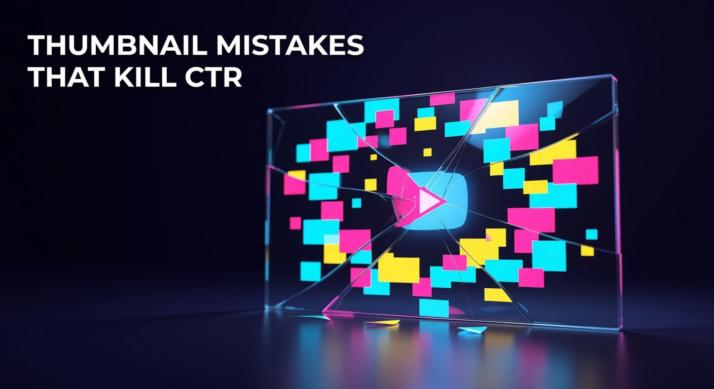
YouTube Thumbnail Mistakes That Silently Kill Your Click-Through Rate
Key Takeaways
- Thumbnails with more than three distinct visual elements average 23% lower CTR than simpler alternatives — clutter is the single most damaging mistake creators make.
- Clickbait thumbnails that promise more than the video delivers create a CTR-retention imbalance that causes YouTube's algorithm to actively reduce your video's distribution.
- Over 70% of YouTube views happen on mobile devices, making small-screen readability a non-negotiable part of every thumbnail design decision.
- Repeating the exact same words on both your title and thumbnail wastes a critical persuasion opportunity — each asset should add new information to drive the click.
- Replacing a low-performing thumbnail on an existing video is one of the fastest, zero-cost CTR improvements available in YouTube Studio.
Identify the silent design errors draining your clicks and learn how to fix them with data
Why Your Thumbnail Is Quietly Costing You Views
YouTube thumbnail mistakes are specific, repeatable design errors that reduce click-through rate by making videos look untrustworthy, unreadable, or irrelevant before a viewer ever watches a single frame. The good news: most of these mistakes are entirely fixable once you know what to look for. Here's the uncomfortable reality most creators skip. A video can have a great hook, sharp editing, and genuinely valuable content — and still perform below its potential because the thumbnail failed the job interview. The thumbnail is the only part of your video the audience judges before deciding whether to give you their time. Understanding what goes wrong in thumbnail design matters more than most creators realize. According to YouTube Creator Academy, 90% of the best-performing videos on YouTube use custom thumbnails. That statistic tells you custom thumbnails are table stakes — not a differentiator. The creators actually pulling ahead are the ones who've eliminated the quiet mistakes that stop even well-designed thumbnails from converting impressions into clicks. This post works as a direct companion to our full guide on YouTube thumbnail design for higher CTR. Where that guide builds from the ground up, this one targets the specific patterns that actively damage performance — so you can audit every thumbnail in your library and fix the ones bleeding views right now.
What Makes a YouTube Thumbnail Silently Fail?
Most thumbnail failures are not dramatic. They don't look broken. They look busy, generic, or slightly off — and that's exactly what makes them dangerous. A thumbnail that looks obviously bad gets replaced. One that looks "fine" gets left alone while it quietly suppresses CTR for months. Research analyzing underperforming thumbnails across multiple niches consistently identifies visual overload as the primary offender. Thumbnails with more than three distinct visual elements — separate text blocks, a face, a background graphic, a logo, and an icon all competing for attention — experience an average of 23% lower CTR compared to cleaner alternatives. Every element you add forces the viewer's eye to make a decision about where to look. On a 120-pixel-wide mobile thumbnail, that decision usually results in nothing registering at all. The second silent failure mode is misalignment between the thumbnail promise and the actual video content. YouTube's algorithm is specifically tuned to detect this imbalance. When a thumbnail generates high initial clicks but viewers leave within the first 30 seconds because the content doesn't match what was implied, the algorithm reads that as a negative signal and reduces the video's reach — often more aggressively than if the video had simply earned a lower CTR from the start. High CTR paired with poor retention is worse than moderate CTR with strong retention. The thumbnail-to-content alignment problem is especially punishing because it looks like success before it becomes a liability.
Common YouTube thumbnail mistakes, their measurable impact on CTR, and the corresponding fix for each
| Thumbnail Mistake | CTR Impact | Fix |
|---|---|---|
| Visual overload (4+ elements) | Up to 23% lower CTR | Reduce to 1 focal point, 1 text phrase, 1 background treatment |
| Clickbait / content mismatch | Retention penalty reduces reach | Match thumbnail promise to the first 60 seconds of your video |
| Low image resolution | 15–25% CTR reduction on large screens | Design at 1280×720px minimum; upload the highest-quality file allowed |
| Title-thumbnail text duplication | Wastes a persuasion touchpoint | Use thumbnail text to add new information, not repeat the video title |
| Unreadable text at mobile size | ~19% CTR drop from font failures | Test at 120px width; use bold sans-serif fonts at large point sizes |
| Inconsistent thumbnail branding | Channel treated as multiple micro-channels | Establish a visual template and apply it to every upload |
How Does Thumbnail-Title Redundancy Hurt Your Clicks?
One of the most underdiagnosed thumbnail mistakes is duplicating your video title word-for-word on the thumbnail itself. It feels safe — you're reinforcing the message. But it's actually a missed opportunity that reduces the total persuasive surface area available to you. YouTube's own Creator Insider guidance emphasizes that the title and thumbnail should work as a team, each adding information the other doesn't provide. When both assets say the same thing, you're using two shots to fire one bullet. A viewer sees your thumbnail text, reads the title below it, and gets zero new information from the second asset. Contrast that with a thumbnail that shows a surprising visual outcome or a bold emotional reaction while the title explains the context — together they create a curiosity gap that neither alone could generate. Data from analysis of outlier videos across multiple niches shows that the highest-performing thumbnails complement their titles rather than repeat them. For example, a finance channel video titled 'I Lost $40,000 on This Investment' is far stronger paired with a thumbnail showing a shocked expression and the single word 'MISTAKE' than with thumbnail text reading 'I Lost $40,000 on This Investment' in smaller type. The face communicates emotion, the text on the thumbnail adds a new emotional frame, and the title explains the full story. Each layer builds on the previous one rather than restating it. Auditing your current uploads for title-thumbnail redundancy is one of the fastest zero-cost improvements available. Open YouTube Studio, pull up your lowest-CTR videos, and check whether the thumbnail text could be replaced with something that adds context, emotional contrast, or a specific outcome the title doesn't already state. A single repositioned phrase can move the needle on a video that's been sitting at 2% CTR for months.
Which Thumbnail Mistakes Are Getting Worse Over Time?
Two mistakes in particular are accelerating in their cost as YouTube's feed becomes more competitive: low image quality and inconsistent visual branding. On image quality, YouTube's support for larger file sizes has raised the visual baseline across the platform. Thumbnails that looked acceptable on older standard displays now appear noticeably soft alongside higher-quality competition. The practical fix is straightforward — design at the largest dimensions your workflow supports and upload the highest-quality file your tools produce. The extra file size no longer creates upload friction, and the sharpness difference on large screens is immediately visible to viewers browsing from connected TVs, which now represent a growing share of total YouTube watch time. On branding consistency, the cost of variation compounds with every upload. When your last 40 thumbnails use different color palettes, type treatments, and compositional styles, returning viewers can't develop pattern recognition for your content. They don't see your video in the feed and think 'that's the channel I know' — they evaluate it as a stranger's video every single time. Establishing even a minimal visual template — a consistent font, a consistent primary color, a consistent face position — gives your returning audience a shortcut to clicking without conscious deliberation. Small channels feel this benefit early. Large channels feel it at scale. The investment in template consistency pays compounding returns that individual thumbnail polish never can.
Fix the Mistakes First, Then Optimize Further
The fastest path to a higher CTR isn't a new design system — it's eliminating what's already working against you. Clutter, content mismatch, mobile unreadability, title duplication, and inconsistent branding are each measurable, fixable, and far more damaging than most creators realize until they run the audit. Start with your five lowest-CTR videos that have significant impressions. Apply the six-mistake audit to each one. Replace the thumbnails that fail. Track results over two weeks. That sequence — identify, audit, replace, monitor — is the same methodology that separates channels that improve systematically from those that keep redesigning without a diagnostic foundation. For the full framework on building thumbnails that convert from scratch, explore our pillar guide on YouTube thumbnail design for higher CTR. The two together give you both a construction playbook and a repair manual.