
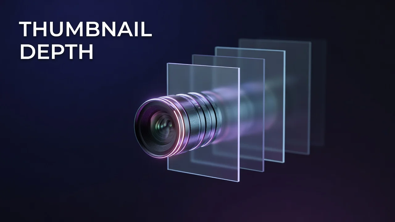
YouTube Thumbnail Depth: Layering and Lighting for More Clicks
Key Takeaways
- Thumbnail depth is the illusion of three dimensions created by separating your subject from the background with layering, lighting, blur, and outlines.
- Cut out your subject and add a 3-5 pixel contrasting outline or subtle outer glow to instantly lift it off the backdrop.
- Roughly half of all YouTube channels sit between 2% and 10% CTR, and a subject that visually pops forward is one of the fastest ways to climb within that range.
- As feeds get more personalized and mobile-first, flat thumbnails increasingly blend together while depth-driven ones keep winning the click.
How layering, lighting, and subject separation make your thumbnail pop off the feed
The Overlooked Design Lever Hiding In Plain Sight
Thumbnail depth is the illusion of three dimensions created by separating your main subject from the background using layering, lighting, blur, and edge treatments like outlines or glows. When a thumbnail has depth, the subject appears to lift forward toward the viewer, and that visual pop is one of the most reliable ways to raise click-through rate in a crowded feed. And here's the thing most creators miss. They spend hours picking the perfect red, testing five font weights, rewriting the overlay text... but the thumbnail still feels flat. Lifeless. Like a sticker sitting on a wall. That flatness is a click killer, because YouTube's feed is a wall of competing rectangles, and the human eye is wired to notice things that appear closer and more dimensional. A subject that reads as "in front" of its background gets attention before a viewer has even processed your title. This is craft that sits right alongside color and composition in our complete guide to YouTube thumbnail design for higher CTR, but it rarely gets its own spotlight. In this post you'll learn exactly why flat thumbnails underperform, the specific layering and lighting techniques that create depth, and a repeatable workflow you can apply to your next upload. No design degree required, just a clear understanding of how the eye reads dimension and how to build it into every frame.
Why Do Flat Thumbnails Lose Clicks?
A flat thumbnail is one where every element sits on the same visual plane, with no clear separation between foreground and background. The result is a busy, low-contrast rectangle where the eye has nowhere obvious to land. In a feed where roughly half of all YouTube channels sit between 2% and 10% CTR, that split-second of confusion is expensive, because viewers scroll past anything that doesn't resolve instantly. Depth solves this by giving the eye a hierarchy: subject first, context second. When your subject is clearly lifted off the background, the viewer's brain registers a focal point in milliseconds and is far more likely to stop. Think about the thumbnails that consistently overperform in high-CTR niches like gaming, which averages around 8.5% organic CTR: they almost always feature a crisp, well-lit subject that reads as physically closer than everything behind it. Flatness, by contrast, forces the viewer to do the work of finding your point, and most simply won't. Depth does that work for them, and that is why it quietly moves the click-through-rate needle more than another shade of yellow ever will.
How flat and depth-driven thumbnails compare on the signals that influence click-through rate
| Design Attribute | Flat Thumbnail | Layered (Depth) Thumbnail |
|---|---|---|
| Focal point | Ambiguous, eye wanders | Instant, subject reads first |
| Subject-background separation | None, elements blend | Clear via outline, glow, or blur |
| Perceived at small mobile size | Muddy, hard to parse | Subject still pops |
| Time to comprehend | Slow, viewer scrolls past | Milliseconds, click-ready |
| Typical feed outcome | Blends into neighbors | Stands out from neighbors |
How Do You Add Depth To Thumbnails?
You build depth by treating a thumbnail as stacked layers rather than one flat image, then using contrast and light to push each layer apart. Start by cutting your subject out from its original background, a technique the YouTube Creator Academy has long echoed in its guidance that thumbnails must remain legible even at the tiny sizes viewers actually see them at. Once the subject is isolated, add a thin 3-5 pixel contrasting outline or a subtle outer glow to create instant edge separation, so the subject appears to lift off the backdrop. Next, apply depth of field: a gentle Gaussian or lens blur on the background mimics how a camera focuses on a close subject, immediately signaling that one element is nearer than the rest. Lighting seals the effect, because a rim light or brighter highlight on the subject against a darker, desaturated background reinforces the sense of dimension the way real-world light does. You can also layer a midground element, like a partially visible object or a soft gradient halo, between subject and background. Each of these choices is small on its own, but stacked together they transform a sticker-flat image into something that feels tangible. This is precisely the kind of layered composition that platform tools like Thumbnail Studio's Style Match and Host Face features are built to automate, compositing a lit subject cleanly into a designed scene.
Where Thumbnail Depth Trends Are Heading
The direction of travel is clear: as YouTube leans harder into personalized, mobile-first feeds, the competition for a single glance keeps intensifying. Thumbnails no longer sit next to random neighbors; they sit next to the most relevant videos the algorithm can find, which means near-identical concepts stacked together. In that environment, flat designs collapse into visual noise while depth-driven ones keep their edge. Expect subject separation, dramatic lighting, and shallow depth-of-field looks to become table stakes rather than a differentiator. The creators who win won't be the ones who add depth occasionally, but the ones who bake it into a consistent, repeatable production system. That's also where data helps. Testing depth-heavy versions against flatter ones through YouTube's built-in test-and-compare experiments, and tracking which style your specific audience rewards, turns a design instinct into a measurable strategy. Depth isn't a trick that fades. It's a permanent property of how human vision works, and thumbnails that respect it will keep pulling clicks long after the current color fads pass.
Make Your Subject Step Forward, Every Time
Depth is the difference between a thumbnail that sits flat on the feed and one that reaches out and grabs a scrolling viewer. By isolating your subject, adding edge separation with outlines or glows, blurring the background for depth of field, and lighting the subject deliberately, you give the eye an instant focal point that flat designs simply can't match. Start with your next upload: build the layers, then shrink it to phone size to confirm the subject still pops. Test a depth-driven version against your usual style and let the click-through data settle the debate. When you're ready to see how depth fits alongside color, text, composition, and testing, revisit our full guide to YouTube thumbnail design for higher CTR and build the complete system.
Frequently Asked Questions
How do I make my YouTube thumbnail subject stand out from the background?
Cut your subject out into its own layer, then add a thin 3-5 pixel contrasting outline or a subtle outer glow around it. Pair that with a slightly blurred, darker background so the sharp, lit subject clearly reads as closer to the viewer.
Does adding depth to a thumbnail actually improve click-through rate?
Yes, because depth gives the viewer an instant focal point and helps your thumbnail stand out in a feed where most channels sit between 2% and 10% CTR. A subject that visually pops forward gets noticed in milliseconds, which is often the difference between a scroll and a click.
What is the easiest way to add depth of field to a thumbnail?
Apply a Gaussian or lens blur to the background layer while keeping your subject perfectly sharp. This mimics how a camera focuses on a close subject and instantly signals that one element is nearer than the rest.